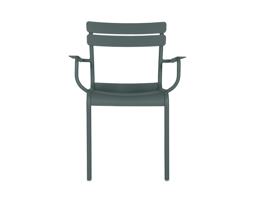
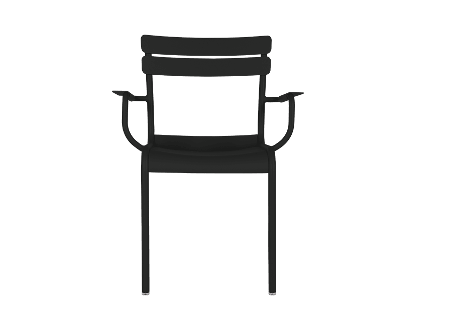
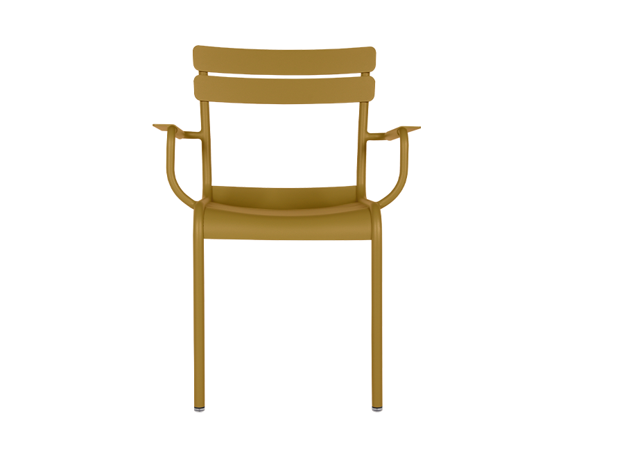
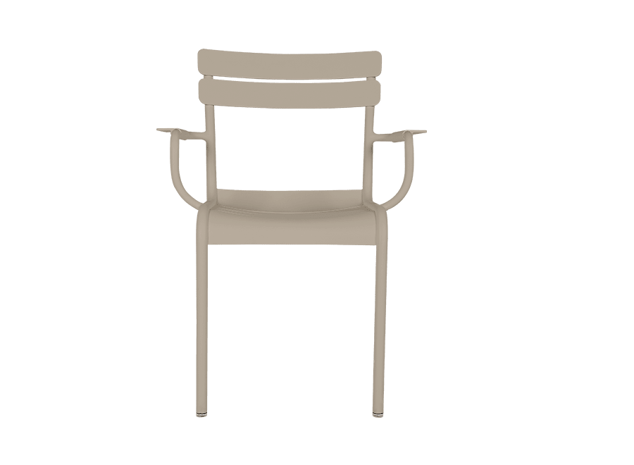
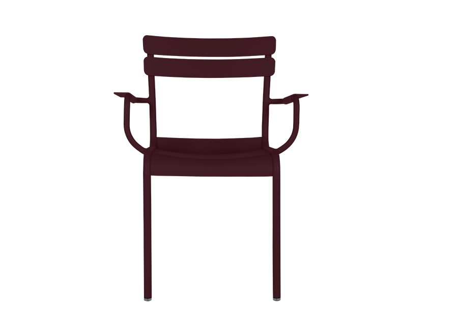
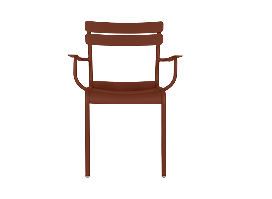
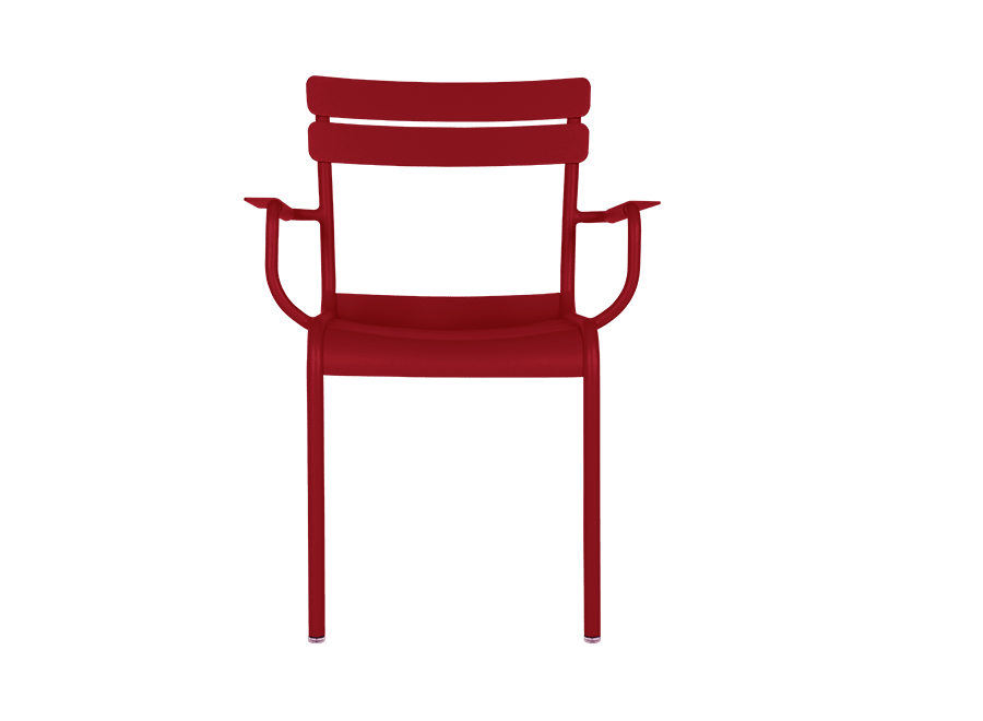
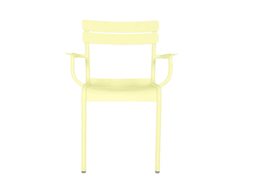
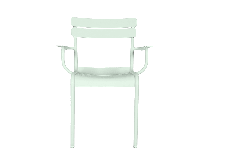
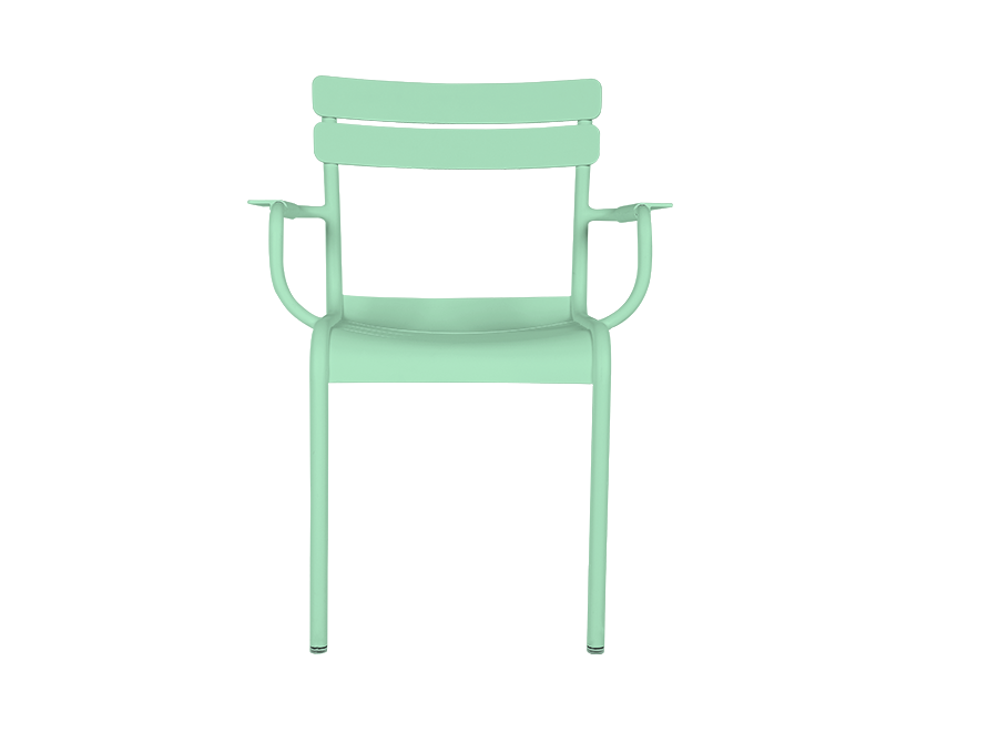
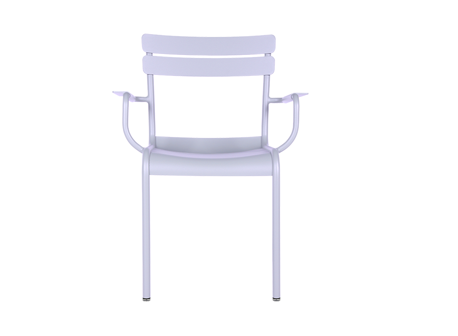
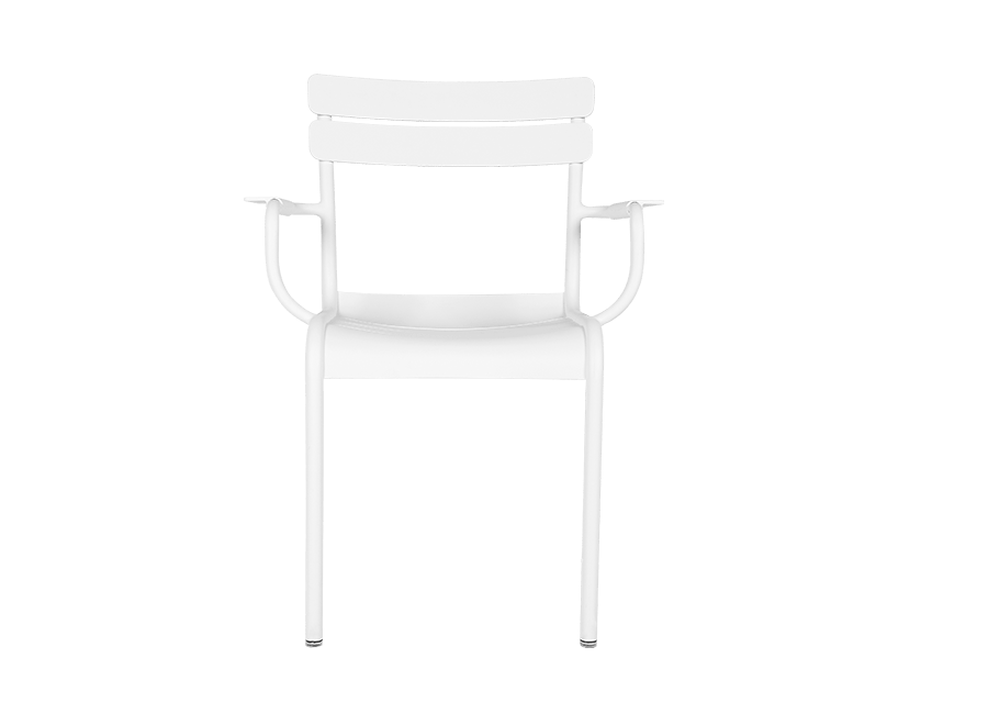
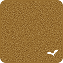
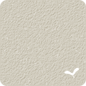
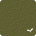
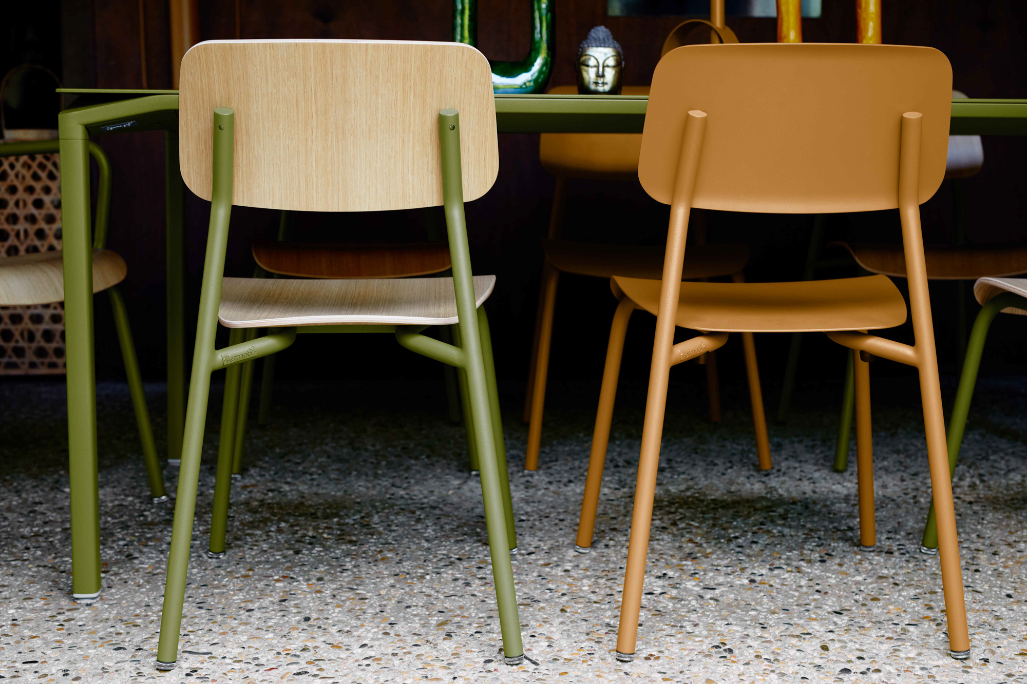
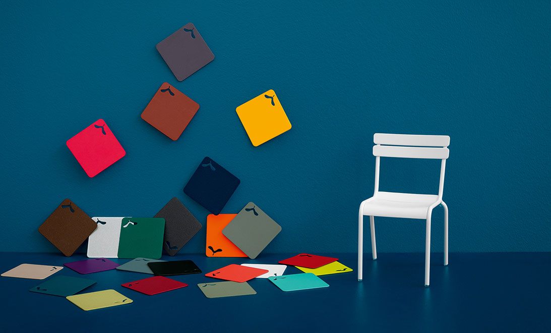
• Clay Grey

    Textured finish

    This warm, timeless grey tone is an absolute must-have.

    Close in appearance to natural white clay, it acts as the link between all the monochrome pallets of the Fermob colour chart. A subtle, unique, almost powdery hue, it creates worlds full of softness.
  • Exclusively developed for Fermob,

    Lapilli Grey brings a burst of life to the color chart thanks to its all new finish. The combination of the two grey bases create a speckled effect which adds depth to our classic textured finish. Lapilli Grey will remind you of the fine lava stones from erupting volcanoes. A return to minerals, to our Earth, generating a feeling of stability, endurance and tranquillity.
  • Storm Grey

    Speckled textured finish

    This refined, textured bluish

    grey is as soft as velvet and just as deep. These fine aluminium slightly glittery particles enable it to contribute softness and shine to any furniture decorated with it.
  • Anthracite

    Speckled textured finish

    This ultra-dark,

    grey shade and its textured and luminous finish give the material an almost mineral-like appearance. With its slightly glittery finish, Anthracite is just waiting for the sun's rays to brighten up your furniture.
  • Liquorice

    Textured finish

    Liquorice is THE absolute black:

    its matt, textured appearance lets it assert itself and makes it into an essential hue.
  • Deep blue

    Textured finish

    An extremely dark blue, deep and matt...

    ... where design meets the deep blue sea.
  • Acapulco Blue

    Textured finish

    Mysterious & soothing,

    Acapulco Blue brings new perspectives to the Fermob colour chart. In conjunction with shades of green or blue, it brings soft harmonies to the garden. This new, deep colour will our gardens with a refreshing intensity.
  • Cedar green

    Textured finish

    The oldest colour in the Fermob colour chart,

    it’s THE traditional colour in the garden. It was reworked several years ago to give it more light, and has lost none of its charm and authenticity, while remaining thoroughly contemporary.
  • Rosemary

    Textured finish

    Capturing the light!

    Behind its apparent gentleness is an assertive, sharp, modern colour. Perfect for the garden with its natural hue. Its silvery tones give it sharpness and light. Rosemary enhances the more vivid colours of the colour chart, while it works in harmony with the other green shades. A real treasure!
  • Cactus

    Textured finish

    A natural, textured green

    This ultra-natural green tone is all about the great outdoors and relaxation. This slightly grey hue - somewhere between olive, oak and cactus in shade - is reminiscent of heathland. This elegant, subtle new Fermob colour is great for creating soft, warm settings.
  • Willow Green

    Speckled textured finish

    What could be more natural when you want to blend in with nature?

    This pastel green tinged with sweetness will appeal to all nature lovers. Its slightly textured, matte shade brings a note of softness and acts as a base for other green shades. Willow green: a timeless and authentic base to mix and match at will.
  • Pesto

    Textured finish

    A mixture of green with a touch of yellow

    to assert its character as a unique colour. Why not associated it with our other greens (Cactus, Willow Green, etc.) to create a welcoming natural atmosphere.
  • Gingerbread

    Textured finish

    A warm and reassuring colour,

    that recalls happy family times. As its name suggests, Gingerbread is a mixture of sweet, golden, honeyed tones that goes perfectly with various colour combinations, and particularly warm shades. It can also bring a little softness to our mineral tones. Any why not add touches of it here and there to warm up to your indoor atmospheres?
  • Nutmeg

    Speckled textured finish

    Nutmeg appeals with its simple,

    soft and warm hue. Finely textured and speckled, it creates harmony between different colours.
  • Black Cherry

    Textured finish

    Bold, enticing color that is simultaneously deep, understated, and warm,

    with a character all of its own. Elegant, Black cherry brings a vintage touch to your outdoor décors. The most versatile colour on our chart, it pairs equally as well with both warm and cold shades, helping you create a unique ambience whatever your tastes.
  • A powdery, authentic, glowing hue,

    decorates furniture with a fiery temperament. Its elegance chimes with the present-day trend for returning to the roots and the land.
  • Chili

    Textured finish

    A deep, textured red;

    A warm, sensual colour that exudes authenticity and brings elegance and warmth to furniture sets: With Chili, things will be hotting up!
  • Poppy

    Smooth finish

    A lively, emblematic colour

    this stunning red is used in touches on furniture sets and attains its full splendour as a single colour. With its smooth, slightly shiny finish, its brilliance surpasses itself in the sunshine.
  • Capucine

    Textured finish

    A fine flower of a colour that symbolises lovers.

    Capucine embodies a successful marriage, between orange and pink. It’s gentle but far from characterless. It has an appetite for life and can blaze with passion! It knows its classics well and knows how to boost them.
  • Frosted Lemon

    Textured finish

    This yellow, almost white tone

    brings memories of childhood holidays flooding back.
    With its bright, fresh, summery vibe, it’s the lemon sorbet we all know and love! This new colour adds some zest and energy to our pastel trend.
  • Ice Mint

    Textured finish

    This tone, part-way between blue and green, is a breath of fresh air.

    A vibrant shade, like white with a hint of colour, it can be combined with other natural tones to create tropical settings, or with bolder shades for a vintage look.
  • Opaline Green

    Textured finish

    The chameleon of the colour chart!

    Looking bright and refreshing alongside pastel hues, it calls to mind the Arctic and the Northern Lights when combined with our blues and greys. But put it alongside our other greens and it brings back memories of summer holidays searching for pretty pieces of polished glass by the sea.
    Opaline green is a modern colour bursting with joy. Associate it with Capucine and Poppy and it takes on a floral quality. And in harmony with our other pastel shades – Clay Grey, Ice Mint and Frosted Lemon – it simply exudes vintage.
  • Marshmallow

    Textured finish

    Naturally soft, reassuring and luminous,

    Marshmallow has also plenty of character. It's a lively, punchy colour that goes with both soft and brighter shades. Associated with our pastel colours, it recalls childhood snacks, with a mix & match of soft shades. And with our blues and greens, Marshmallow brings contrast to subtle, understated combinations…
  • Cotton White

    Textured finish

    Who says white isn't a colour?

    Fermob’s Cotton White asserts and helps reveal the other tones in the colour chart. Its powdery finish means that, when used in monochrome, it will really enhance any item of furniture. An absolute dream!

The color combos recommended by our designers:

  • Gingerbread
    Marshmallow
    Opaline Green
  • Gingerbread
    Clay Grey
    Rosemary
  • Gingerbread
    Frosted Lemon
    Pesto
  • Gingerbread
    Nutmeg
    Red Ochre

Color expert

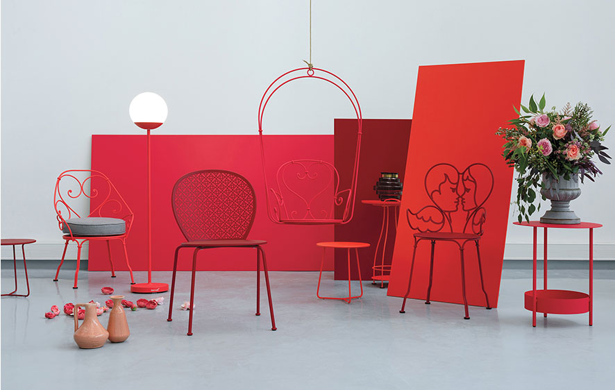
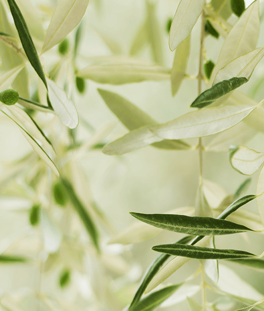
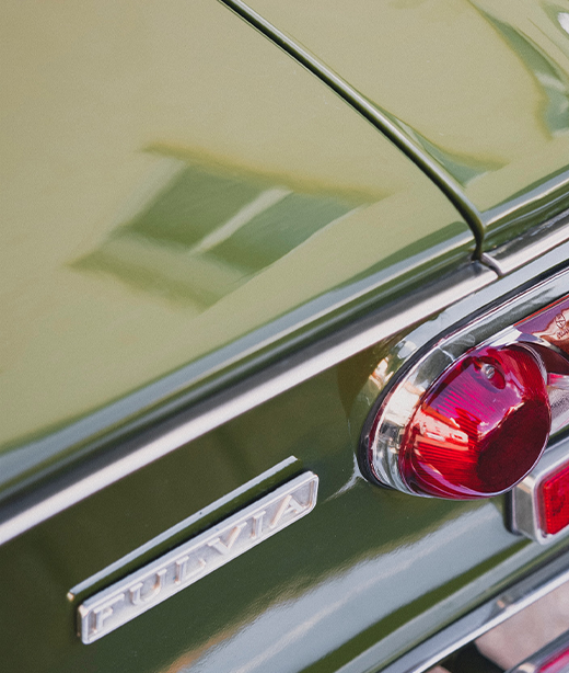
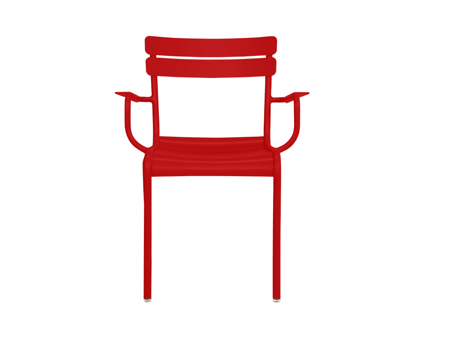
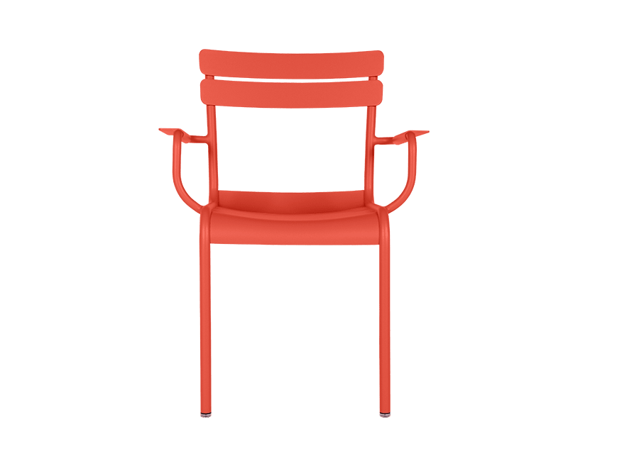
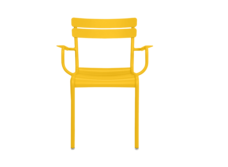
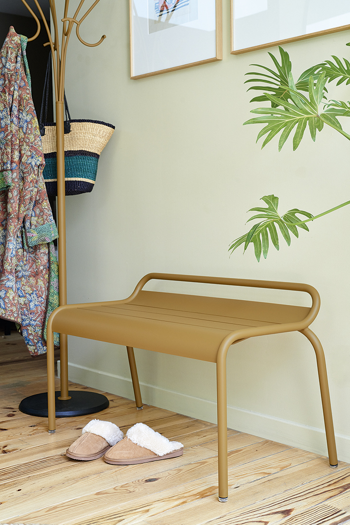
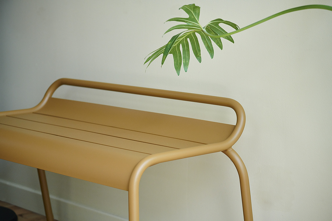
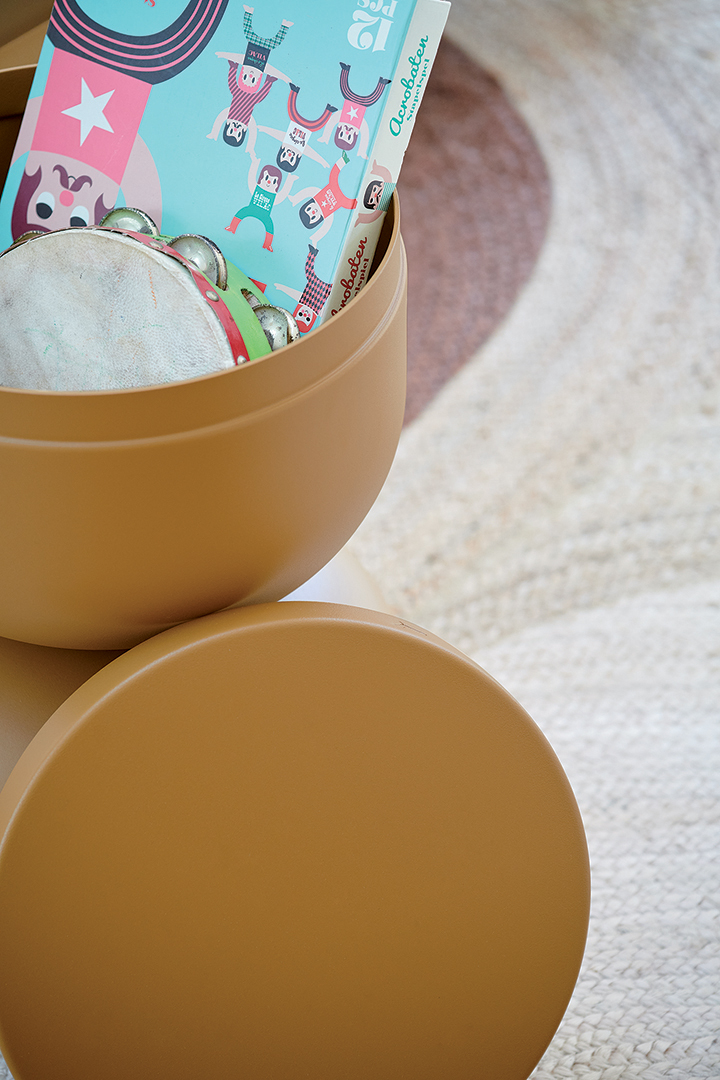
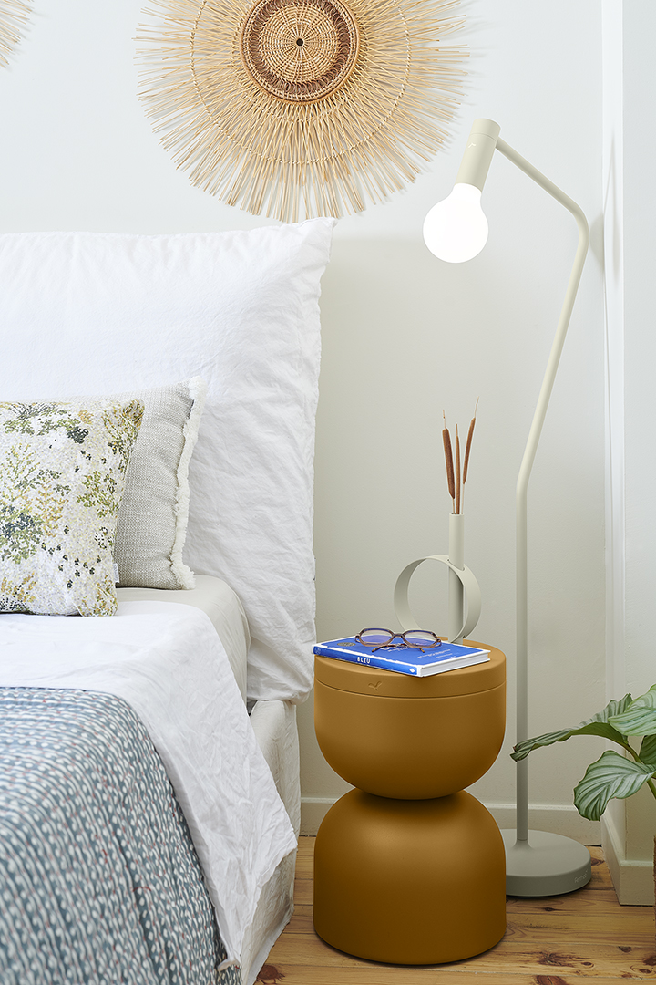
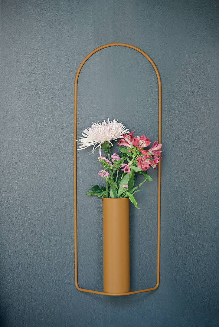
Back in 1996, when all gardens were getting bored with British racing green or white, fermob came along and change all that. We blazed a trail and set the trend, ripping up the rulebook and bringing colour into the Garden. With that came our trademark "joie de vivre" – and Furniture suddenly became something to smile about. Ever since then, we’ve been unveiling new tones over the years, each one as cheeky and impudent as the next.
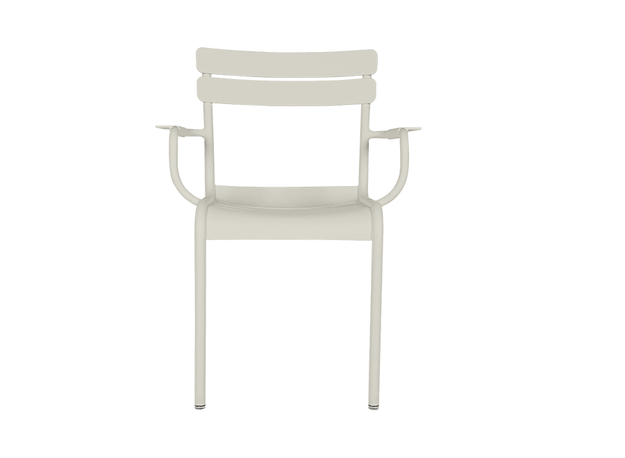
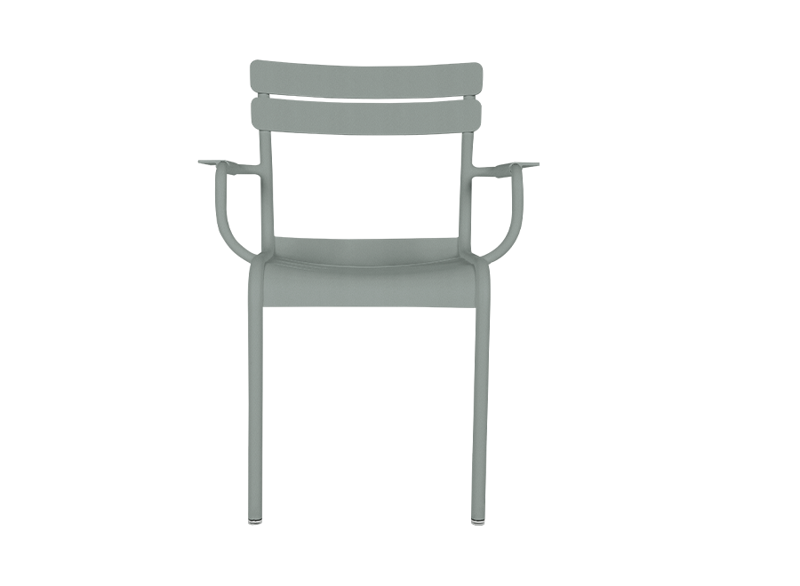
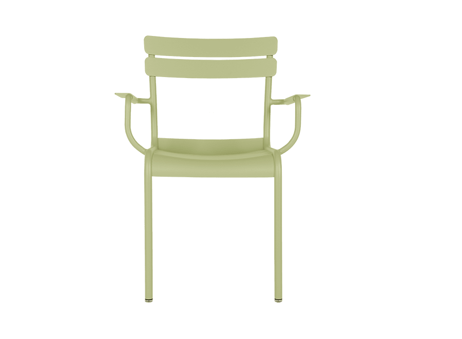
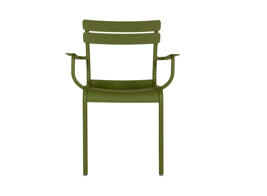
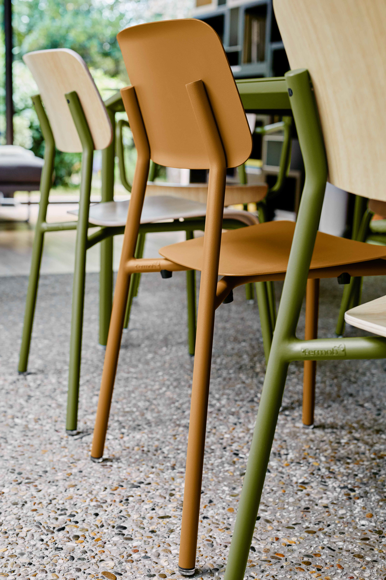
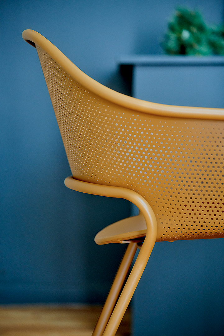
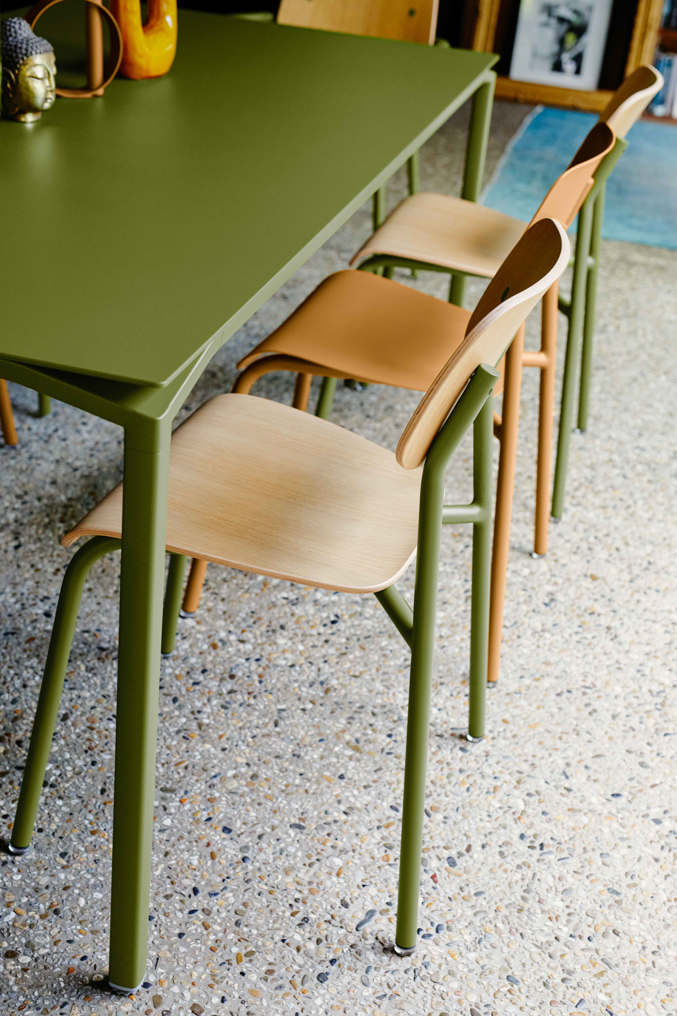
Our in-house painting lines are of the most efficient in Europe. It allows us to control the finishes and to ensure consistently high-quality application.

Learn more

Choosing the right colour

Faced with an increasingly bewildering array of colour charts, it can be hard to choose the right combinations. Will I make the right decision? What if my chosen colours date quickly? These may be existential questions, but Mathilde and Marion, Fermob’s visual merchandisers, are here to cut through the grey areas (no pun intended!) with some tips to help you choose a furniture colour (or colours) to suit your style.

Read the article